brand guide
2023
Fredy Chevy
Brand Identity | Brand Guide | Website Design | In-Store Prints | Sales Materials | Digital Marketing | Merch
Fredy Chevy was a meaningful project for me, rooted in a rural Ohio community that felt a lot like where I grew up. After years of automotive branding, I understood how to blend OEM requirements with a dealership’s unique personality — and when it’s done well, it’s almost magical how personal a brand can feel. For this identity, I wanted to capture the warmth of small-town life: the feeling of stopping by your mom’s house, flipping through an old yearbook surrounded by quilts and doilies, and remembering Friday night games where the whole town showed up. That local sports energy shaped the logo, while the rest of the system leans into comfort, nostalgia, and family. The owner was so moved by how true it felt to his community that he shared it proudly with friends and family — a response that made the project even more special.

more projects
iconic brand elements

Kitsch Patterns
Kitschy textures like bandanas, ’90s sheet patterns, and plaids are found in so many homes that they instantly evoke a sense of nostalgia and lived-in familiarity.

Varsity Elements
Varsity-style fonts and bold outlines instantly signal local sports culture, bringing in the familiar energy of high school teams, Friday night games, and the community pride that comes with them.

Distressed Texture
The distressed textures are overlayed on all photography and intentionally picked for materiality. They give the brand a worn-but-not-broken feel — something strong, lived-in, and shaped by real use.
iconic projects

Website
The website brought the new brand to life online, creating a seamless, welcoming experience that felt familiar, while introducing a fresh, unified identity. Every element was designed to reflect the community’s values and make the dealership feel approachable, trustworthy, and distinctly their own.

Digital Ads
The digital ads extended the brand into clear, compelling messaging that resonated deeply with the rural Ohio audience, blending familiarity with fresh visual energy. They outperformed expectations, achieving engagement rates four times higher than the industry average.

Brand Guides
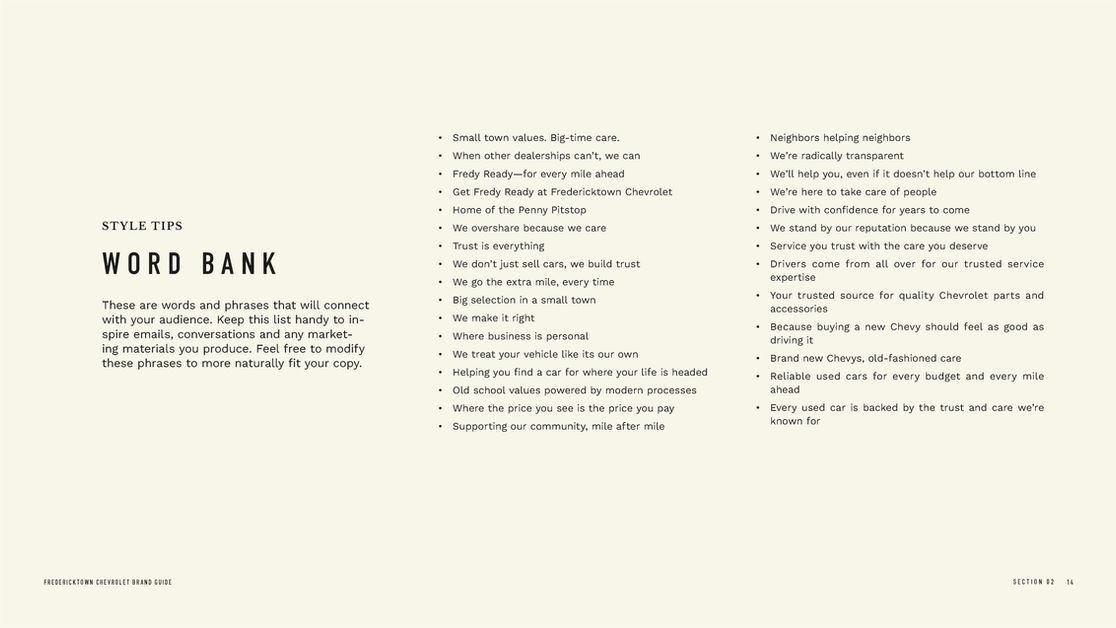
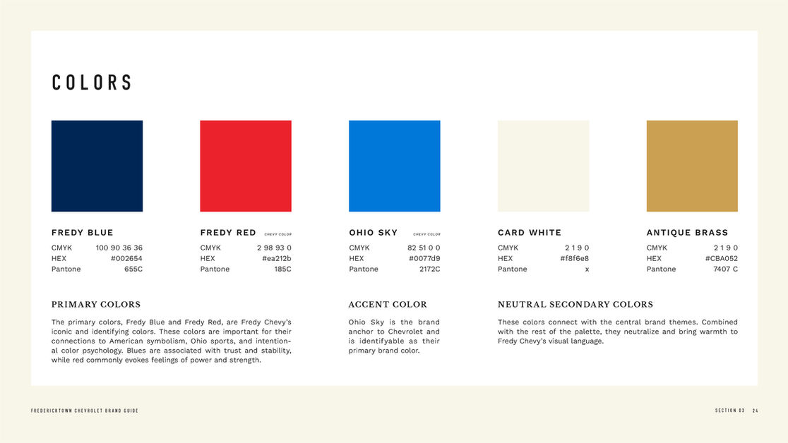
The brand guide outlined the full visual identity, and I also created an internal cultural guide to help the team understand the meaning behind the design and align everyone with the brand’s core values.


